What it’s for
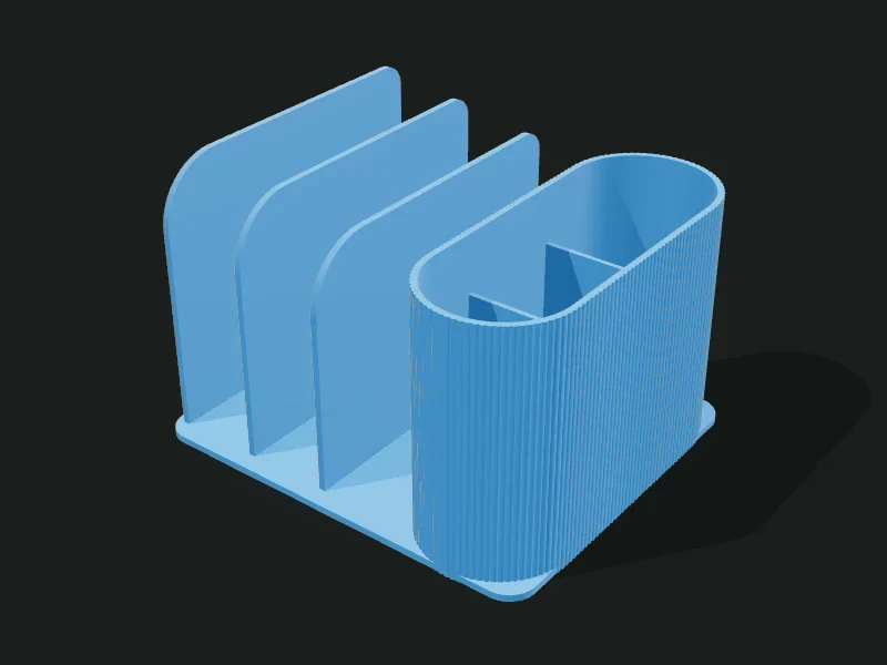
A desk file sorter for folders, notebooks and papers: a base with vertical panels of stepped height (the first one is the tallest) forming slots, and on the side a pencil cup divided into compartments. Everything comes out as a single part.
Ideas
- Organize folders, notebooks and the notepad on the desk.
- Magazine or catalog holder in a shop.
- Sorter for bills or envelopes by month.
- Stand for tablets and cookbooks.
Step by step
- Choose a preset: «Large», «Compact 2 slots» or «Stepped folders only».
- In «Base» adjust the width and depth (what it takes up on the table).
- In «Panels» choose how many slots, the height of the first panel and how much each next one drops.
- Round the panels’ top corners with the front and back radii.
- Choose which side the pencil cup goes on (or remove it) and how many compartments it has.
- Export; the app warns you if a slot ends up too narrow.
Tips
- Slots must be at least 12 mm for a folder to fit; if not, lower the number or raise the width.
- A drop of 5–10 mm per panel lets each folder’s spine show.
- Panels over 150 mm are best made 3 mm or thicker, so they don’t bend under the weight.
- A big front radius (40–60 mm) gives the classic curved magazine-rack look.
Presets
Parameters
Baseplate
The bottom plate the panels and the pencil cup stand on.
Total width, from left to right. It’s split between the slots and the pencil cup.
Depth of the base, from front to back. It’s also the length of the panels.
Thickness of the base. 3 mm makes it sturdy; raise it if you want it heavier so it doesn’t tip over with tall folders.
Rounding of the base’s corners seen from above.
Partitions
The vertical plates forming the slots. They go from front to back and step down in height one after another.
Number of slots for folders. The available width is split equally among them.
Thickness of each panel. 2.5–3 mm is sturdy; thinner may bend with heavy folders.
Height of the first panel (the tallest, on the side opposite the pencil cup).
How much lower each panel is than the previous one. 0 leaves them all equal; 5–10 mm gives the stepping that lets you see what’s in each slot.
How far back from the front of the base the panels start. A 5–10 mm setback leaves a ledge at the front to rest papers on.
Rounding of the panels’ top front corner. Big (40–60 mm) gives a magazine-rack curve; 0 leaves a square corner.
Rounding of the panels’ top back corner. A little (10–20 mm) softens the profile.
Pencil cup
A tall cup on the side, divided into compartments.
Whether it has a pencil cup and on which side. Its wall acts as the last panel.
Width of the pencil cup (left to right). 50–65 mm fits a hand comfortably.
Height of the pencil cup. It’s usually a bit lower than the first panel.
How many compartments the pencil cup is divided into (front to back).
How much lower than the rim the pencil cup’s dividers are. 20–30 mm lets you see and grab the pencils.
Thickness of the pencil cup’s walls. 2 mm is sturdy.
Outer texture
Decorative relief on the outer walls. It doesn’t change the inside sizes.
Relief on the outer walls. The texture is added outward: the inside and the wall thickness don’t change, so inserts and usable sizes stay the same. «Ribs» and «Flutes» are vertical, «Rings» horizontal, «Waves» helical and «Knurl» a diamond pattern that gives grip.
How far the texture sticks out (mm). 0.6–1 mm shows well without overdoing it; more than 2 mm adds a lot of material and print time.
Spacing between ribs, flutes or waves measured around the part. Small values give fine striping; large ones, bold. It should be at least 3 times the relief.
Vertical spacing between rings, waves or knurl diamonds. With 0.2 mm layers, less than 2 mm looks stepped.